Coinstar for Financial
Brand Guidelines
These guidelines describe the visual elements that represent Coinstar for Financial's identity. This includes our name, logo and other elements such as color, typography and graphics. Sending a consistent and controlled message of who we are is essential to presenting a strong, unified image of our company.
These guidelines reflect Coinstar for Financial's commitment to quality, consistency and style. The Coinstar for Financial brand, including the logo, name, colors and identifying elements are valuable company assets. Each of us is responsible for protecting the company’s interests by preventing unauthorized or incorrect use of Coinstar for Financial's name and marks.
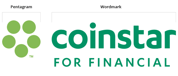
Brandmark Anatomy
-
Coinstar for Financial Logo This two-color version is to be used most often. It is suitable on white or light-colored backgrounds when color is supported.
Primary Logos
This full-color version of the primary logo should be used whenever possible. Use the complete electronic artwork in the way it is provided. Do not alter, distort or realign the logo in any way. No elements should be added to the logo. The file below is suitable for print applications. See "Logo variations" for web assets.
Download All Primary LogosVariations of Logos
These logos are suitable for use in digital applications. The full-color version should be used on white and light-colored backgrounds. The black version should be used on light backgrounds only in situations where color is not supported. The white version should be used on dark backgrounds in all cases, whether color is supported or not.
Download All VariationsUsing The Brandmark with Photography
Listed here are a few examples of how the Coinstar logo is used with the brand photography.Logo Applications
This two-color version is to be used most often. It is suitable on white or light-colored backgrounds.
Logo on Light Background
Logo on Dark Background
Improper Usage
Here are examples of what you shouldn't do with the Coinstar logo
Never use logo without Pentagram
Pentagram should only be placed on the left side of the logo
Never stack the Pentagram
Primary Color System
Phasellus ut orci ornare, iaculis massa vel, efficitur quam. Etiam malesuada risus ut maximus molestie. Sed varius pulvinar sem. Maecenas vehicula purus non vestibulum luctus. Nunc metus mi, laoreet at massa mollis, imperdiet hendrerit massa.
Secondary Color System
Phasellus ut orci ornare, iaculis massa vel, efficitur quam. Etiam malesuada risus ut maximus molestie. Sed varius pulvinar sem. Maecenas vehicula purus non vestibulum luctus. Nunc metus mi, laoreet at massa mollis, imperdiet hendrerit massa.
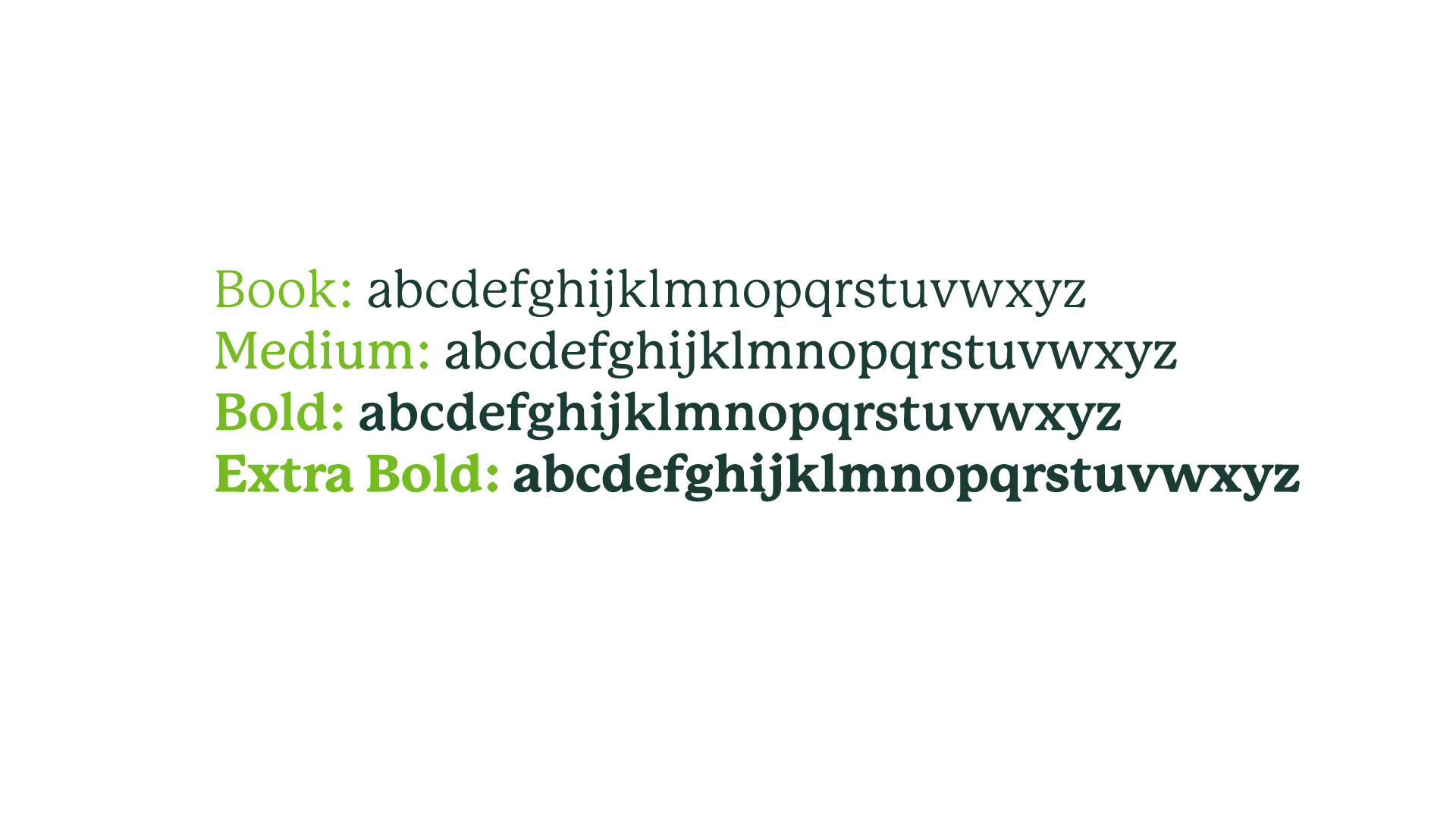
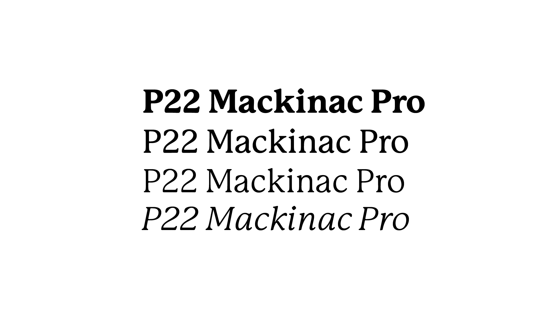
P22 Mackinac Pro
Display / Headline Type Face
To be used on a larger scale and primarily for main headers. Varying weights may be used for emphasis. This typeface can be accessed through Adobe Fonts.
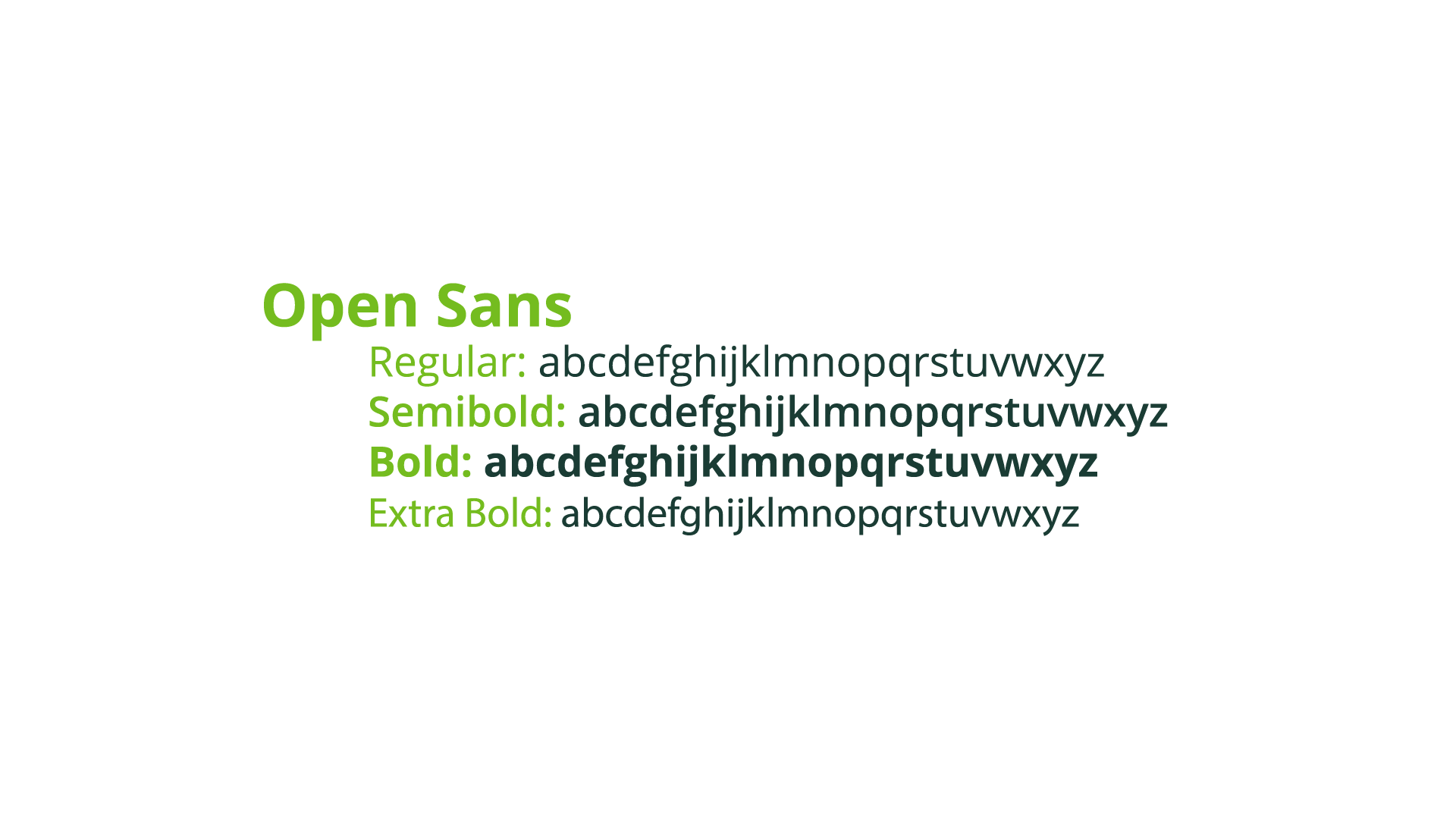
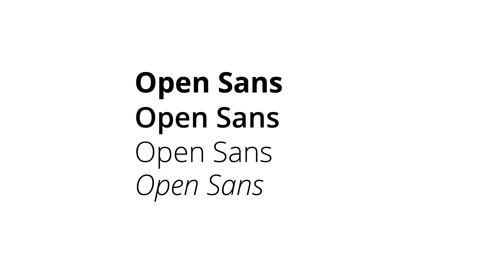
Open Sans
Body Copy
To be used on longer-form copy and at a smaller scale. Various weights can be used for hierarchy, emphasis, and variety. This typeface can be accessed through Adobe Fonts.
